Sunday, June 29, 2014

Review: "Grasshopper Jungle" by Andrew Smith

"There are things in here: babies with two heads, insects as big as refrigerators, God, the devil, limbless warriors, rocket ships, sex, diving bells, theft, wars, monsters, internal combustion engines, love, cigarettes, joy, bomb shelters, pizza, and cruelty. Just like it's always been."

My feelings about this book are so mixed you could pour them in a pan, pop it in the oven, and pull out a fluffy cake half an hour later. You know what I mean.

Today, I'm reviewing Grasshopper Jungle by Andrew Smith.

***

First off, I want to complement the publishers (Penguin Group/Dutton) for dragging me in by the hair. I found this at my local bookstore and, upon seeing the cover and reading the blurb, was drawn in. I decided to grab the book after some contemplation, and along with another purchase and an extra book called-in, I had a stack of reading to go through. I started this one immediately.

I began Tuesday. I finished today (actually, technically yesterday - today is just two hours old). I read a part a day, skipping Thursday, and finished a few hours ago. I'm still working on digesting all of the story, but I'll do my best to discuss the contents, but I will discuss some spoiler-y stuff at the bottom. Don't worry; I have warnings posted.

***

One of the things that you can complement Smith for is his excellent mastery of voice. He tells the story from the perspective of Austin Szerba, a 16-year old Lutheran boy who has a knack for history and, oddly enough, arousal jokes. Yeah, not the first person you'd think of as a narrator, but a good choice for the novel. Besides, Austin's not the weirdest part of this story, not by a long shot.

Anyways, Smith's use of voice was excellent, exceptional even. The issue was that because of the nature and voice of the protagonist/narrator, things naturally started to get unhinged and hard to follow. While Austin enjoys history and the connections made in history and the present moment, he tends to ramble a lot. And I mean a lot. A lot of what he rambles about carries throughout the book, of course, but not all of it does, and it results in an awkward dance between the story and what's just going on in Austin's head. In addition, it also makes it harder to tell what is happening in the story; while it's not always difficult to piece together the events, there are certainly moments that left me head-scratching.

It was confusing, to say the least.

***

Now, as for the plot.

*intake of breath*

The plot is about how two boys accidentally let loose an army of hungry and horny praying mantises that put their Iowan town - and the world - in grave danger, leaving them the only two who can stop the stampede.

...

I'm seriously not kidding.

The moment I read the blurb, I laughed out loud. I mean, nobody publishes plots like those. That's the type of plots typically joked and laughed about, right? That's the type of plot a twelve-year old would come up with! Despite that - more like because of it - I was prepared to pick up the book and be dragged into a crazy ride.

I mean, it's fun, silly, and still incredibly contemplative.

Oh, and trippy. Really trippy.

...and I'm still not kidding.

***

The other reason I decided to pick up this book was because I had seen the cover of the book before. Where? Online, at the Diversity in YA tumblr. Unbeknownst to me, I'd been on the diversity side of writing for years, since I've been writing about sexuality and LGBT characters since - hmm - 2009-ish? Of course, I was fooling around a little more back then, but I began to delve more seriously into the issue when I began writing Project: Faith. That was not an issue book, of course; I wanted to work in a world where that didn't matter, or at least didn't come clean. The sequel, Project: Hope, did become more issue-oriented.

But enough about me. This is about Grasshopper Jungle. And the easiest way to categorize it is in the same way I categorize Hope - it's issue-oriented, but it's not the main focal point of the novel.

Now, I should introduce two of the main characters: Shann and Robb. Shann, of course, is Austin's girlfriend; Robb is his best friend. The sexuality conflict in the beginning stems from, strangely enough, Austin's oft-mentioned fantasy of having sex in Robb's car with Shann while Robb watched. What eventually transpired was a more serious, gut-wrenching talk about his feelings both for Robb and Shann, which, in some ways, mimic the way many teenagers feel these days. I'd want to hope I'd know - I've sort of been there.

So the subject of sexuality was tackled, and it was tackled in a very meaningful and accurate way. I mean, it's not rocket science, but Smith managed to discuss it without being nasty, crude, or rude. I mean, he talks about sex more crudely because of Austin's voice, but it's all relative.

...an aside note, as I was editing this: Austin, while struggling with his bisexuality, also seems to be dealing with some polyamory as well. I don't know that polyamory is necessarily connected to sexuality - although I tend to think more about orientation than anything - but I will say that I think he did tackle it meaningfully within the context of the story. Could've done that part better, maybe, but he took a chance. Gotta admire that.

***

Voice was grand, plot was trippy, and sexuality was acceptable. Anything I really didn't like?

Yeah, admittedly, there was. And it had to do with keeping track of events.

Now, I don't want to start spoiling stuff yet, but to put it simple, the narrator would discuss his current situation, typically with his friends or something . . .and then he'd suddenly start talking about "on the other side of town" or "at the same time" or "in the meantime", which was incredibly disorienting and not at all fun to read. I mean, I can understand why the story was told that way, because it's discussed more at the end of the book, but it's super confusing in the meantime. I mean, I want to know about the characters I have emotional investments in . . . I don't need to know about the people getting maimed all around town.

The bright side to this is that Smith does a great job of keeping everything connected in some way. For example, there are pieces you don't even think about the first time around, which are then referred to later in the book. And they're even plot significant! It's not an easy task to keep track of that, but it certainly narrows down the number of plot holes. I'll applaud for that, of course, but I still insist that it could've been done better. Flashback if you must - I love flashbacks when done right - but don't interrupt the action, please.

***

I think that I've talked enough about the style points I wanted to cover - for now, I think I'm going to get into spoiler territory about specific points in the book, mostly because there was at least one part I wanted to discuss.

Again, SPOILERS AHEAD.

***
***

First - still loving the cohesion. The beginning of the book where Robb is nosebleeding onto the alley's blacktop is so well-connected to the rest of the plot, especially as we begin to learn about 412E, that it's left me in awe. It's not easy to tie all of those parts together, and especially in a manner where I can still remember that beginning event without having to go back and look for the scene again. Excellent job indeed.

***

That being said, I can't keep up with the names. I know Smith's trying to keep everything neatly tied, but I don't need to know everybody's name, especially the name of the cat the neighbor has. Eeep.

***

The history lessons about Austin's family tree were pretty interesting, although again, there were so many names it was hard to remember. It was cool to read through it, though. Props once more.

***

Which mother is named Connie?! Are they both named Connie?! Good gravy, save me.

***

I need to bring up Shann's behavior in part 4 specifically, because all of a sudden, she turns into a bitch. I mean, I liked her before, but then she suddenly has it put-together that Robb loves Austin and they've kissed and in an instant, Shann becomes Homophobe of the Year. What the hey? That came from south of WTF-land.

I mean, I'm not saying it was bad.

But I did want a warning.

***

And then Shann and Austin fuck everything better.

***

. . . or . . . not?

***

WAIT A SECOND THAT WAS HER FIRST TIME.

I KNOW IT CAN HAPPEN BUT WHAT KIND OF TIMING IS IT THAT SHE GETS PREGNANT?!

***

I  like the plot twists with the Szerba family. And the talk about Eric. Actually, I just like Eric in general.

***

I mean, I don't appreciate the ONE REFERENCE to Eric contemplating suicide. That was weird and out-of-place and, strangely enough, the one thing not followed up on. Eric, don't die sweetie. You sound cute. Getting convinced by two prostitutes to ask for a blow job makes you one of the cutest characters in the book, which is both pretty weird and definitely not something I ever contemplated writing.

***

Lastly - just to say one more awesome thing about the book - it definitely dragged me along for a ride. I could barely put it down, except for the moments where I needed to stop and breathe. Stuff that intense makes me need to put it down and digest. Not only that, but it made me think, which is wonderful and something I want every book to make me do.

***
***

SPOILERS ARE DONE HERE.

***

So, let me sum it up with a five-point system!

Use of Voice: 5/5. Seriously, I loved the voice. It was unique and telling and just something that lots of people aren't good at that Smith is. So congrats on that point.

Style: 2/5. Again, the interruptions in story were disorienting.

Plot: 4/5. Loved the cohesion, and I loved the strangeness in plot. I mean, it could've been handled differently, but it was still fricken' awesome.

Readability: 2/5. I added this because it really was hard to read. The writing, in and of itself, was simple, but the jumping between history and at-the-same-time's and the present moments was unpleasant, and I wasn't a huge fan of it.

Averaged: 3.25/5, which seems about right, actually. I mean, it was WEIRD, and there were parts of it that were out there, but it was a decent read. It's definitely made me think, obviously.

OVERALL . . . if you want a diverse read and something to make you raise your brow, laugh out loud, and tilt your head to one side, grab this book and give it a once-over (or more, if you like). It was a good and thoughtful read, and it deserves a peruse, especially for the way it was written. Andrew Smith, great job on this book - it was a great story!

Friday, June 27, 2014

Video Games, Art, Minimalism, and Where the Middle Ground Is - Part 4

Hello! I hope that you're enjoying my Video Games, Art, Minimalism, and Middle Ground series regarding Animal Crossing: New Leaf. If you care to see all previous posts, click below:

Part 1 - Interior Design
Part 2 - Patterns and Designs
Part 3 - More about Patterns and Designs
Part 4 - Introduction to Town Decor
Part 5 - Pattern Design in Town Decor
Part 6 - Gardening in Town Decor

Onwards!

***

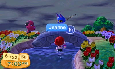
So did you know that in Animal Crossing: New Leaf, you can glitch your way into the water? It's true.


 We're testing to see if Jeanne is a witch. Y'know, because of the time-travelling in Part 3.

 OW! . . . faceplant.

 . . . so she's either a magician . . .

. . . or the worst messiah ever. Burn the witch?

Now, before we all get our stakes out and begin the execution, I think we should think first about - what else? - the town. I mean, look at all of those flowers! We can't execute her without harming the town's decoration, y'know?

And that, everybody, is the topic of today's post: town decoration!


Hey, look, it's Katya- WATCH OUT THERE'S A DUCK.

The act of decorating your town according to your wants and needs is an arduous task, unfortunately, but not one that is an impossibility. There are plenty of great examples of people that have used gardening, pattern design, and public works projects to make beautiful villages.

Unfortunately, I am not one of them.

But! I can, however, educate you about some of the bare necessities of making your town look beautiful, which I will explain using Katya (above) as my dummy. Please pardon her clueless look - she's a n00b.


A note to past me: WHY did you NOT order them more appropriately?! Ugh!

So ignoring the fact that I could've ordered these flowers MUCH more beneficially considering what I was doing, these are the flowers that compose the basics of gardening! There are 4 flowers that are considered the basic flowers, the ones that you can find no matter which Animal Crossing game you play. Those are: the pansies at the far upper left, the tulips on the regular upper left, the roses at the regular upper right, and . . . wait for it . . . the cosmos at the LOWER RIGHT.

Yeah, my ordering skills suck.

The other two flowers are (I think) new to New Leaf, and they are a little more exotic: the violets at the lower left, and the lilies at the far upper right. I don't know about anybody else, but I actually had to export them from outside of my town before I could get them to grow in my town. How? Eh, that's a topic for another day.


Katya, we have a responsibility to show a lack of bias to our audience. That being said, WHY did you ONLY pick BLUE AND PINK hybrid flowers?!

So the above is really the basics to gardening, but that's not all - it's also possible to get hybrid flowers by planting certain flowers next to each other. So from left to right on the picture above, on the bottom row (all of which are hybrid flowers), we have blue pansies, pink tulips, pink roses, blue violets, pink lilies, and pink cosmos. Now, I don't want to get into too much detail about how you get these, because it's a long conversation, so I'll link you here instead, where somebody has put together a wonderful guide. Thank you, anonymous writer!


 Cliffside flowers. This picture is a little out-of-date, by the way, so the background flowers are actually gone.

So flowers can go just about anywhere, to be honest. You can plant them by a cliffside . . .

 This is outside T.J.'s house! Unlike the aforementioned witch, Katya has the courtesy to not break in.

. . . around a house . . .

Well, this is awkward.

. . . underneath a- . . . uh . . .

KATYA! FOCUS! I KNOW THERE'S A BALLOON YOU CAN'T SHOOT DOWN, BUT FOCUS!


Oooh, Jake's gonna be furious . . .

So there's a lot you can do with flowers! Arrange them, plant them, put them in your house (which I didn't have a picture for). But those aren't the only flowers you can get! A feature in the game is one that allows you to get a quote-on-quote "perfect" town, meaning that your environment within the town is clean and filled with enough trees and flowers. Upon reaching this state of perfection, you get the flowers above, Jacob's Ladders. I have several around my town; in fact, I have a perfect town myself, so I got these on my own, unlike my friend who shamelessly stole mine and keeps them in her house. Friend, you know who you are . . .!

I later ran over these flowers and ruined them. I cannot express the rage I felt.

The last type of flower - perhaps the rarest of them all - is the carnation. Carnations can't be imported or grown naturally like other flowers - if you want a whole landscape of carnations, you have to start by getting your in-game mother or father to ship some to you for Mother's and Father's Day(s). After that, you can start breeding them to get red, pink, and white flowers, but this is an arduous task in and of itself. As the caption above states, I even ran over that one set of carnations later on, although luckily for me, I had four other sets and later bred them to include two more. Point being, those flowers are both the holy grail and a nightmare to produce.

So that's gardening, of course, but what else can you do? Certainly that's not all there is to village decoration, or else this'd be a really short post!

You're right. That's why we have PWPs, or Public Works Projects!


Yes, I know what else PWP stands for. My soul feels a little dirty now.

Public works projects are developments that can be placed in your town to customize it for practical, aesthetic, business, and upgrading purposes. PWPs can't be made by just any villager - the first player, the mayor, has to set up the projects his-/herself. There are lots of things I could talk about with these, but I think I'm just going to give you a slide of pictures and explain it in the captions. Away we go!


Practical - although this is the original bridge provided to me in-game, you can add two additional bridges along your town's river.

Aesthetic - while this lightpost does bring light during the nighttime, it's not a necessary part to your town.

Business - this café becomes available to you to add to your town after a certain set of time, and you can easily walk in and order some coffee at any time after construction!

Now, you might be noticing something. Didn't I say that there were four types of PWPs? What about upgrading PWPs?

Well, my friends, in order to discuss that . . .

The Dream Suite - your ticket to jumping into other towns.

. . . we're going to have to take a stroll through some other towns . . .

Friday, June 20, 2014

Video Games, Art, Minimalism, and Where the Middle Ground Is - Part 3

Hello! I hope that you're enjoying my Video Games, Art, Minimalism, and Middle Ground series regarding Animal Crossing: New Leaf. If you care to see all previous posts, click below:

Part 1 - Interior Design
Part 2 - Patterns and Designs
Part 3 - More about Patterns and Designs
Part 4 - Introduction to Town Decor
Part 5 - Pattern Design in Town Decor
Part 6 - Gardening in Town Decor

Onwards!

***

I can't breathe through my nose, and my energy has run away and taken a nap somewhere. Sounds like a perfect time to make another post! *loudly blows nose*

Ahah, look at that dork! . . . wait a sec . . .

So the last time we talked (in Part Two, linked above), I explained about the basics of designing stuff in Animal Crossing as well as discussing Pro Designs and some of the ways to share your designs. That turned into a really big post, which surprised me, so I had to break it off early! Now is when you get to see the other half, which is about A) what you can do with those designs, and B) what I think about the whole process.

Before I could talk about that stuff, though, I had to go nab some more pictures. But for the sake of showing you a new face, I decided to show off another of my characters: Jeanne.

Evidence of time travel? What do you mean, evidence of time travel? That headdress was earned fair and square!

Jeanne's a jerk. So just ignore her.

Now, as I talked about last time, the downside to Pro Designs is that there isn't much you can do with them beyond wearing them as designed, i.e. a hat, shirt, or dress. But those basic designs that you can make without the Able Sisters? Oooh, there is so much you can do with them. For my example, I'm using a "CRY" template I made, which Jeanne is modeling for me above. Not quite her style, but she'll get over it. I think.


Above: The town hall and, in the background, the police station where Jeanne needs to be taken for unruly behavior. Below, the train station, from which Jeanne needs a restraining order.

So what can you use your designs for, you ask? Great question. First off, you can use your design as your town flag, which hangs outside of the town hall and in the train station. Neat, huh? I could've changed it to the CRY design I made, although I actually no longer have the design shown on the flag, and I'd rather keep it . . .

Welcome to Sandhall. Now cry.

It's also possible to lay your designs on the ground. This might lead to the question of "why would you do that", but it's actually a function of the game that lots of people take advantage of. For example, the people of Bumbury have some really awesome town designs, one of which I used . . .

Flashback, where T.J. gets a nasty surprise.

. . . so that Jeanne could make a moat around T.J.'s house earlier in the month. The idea was "You have to celebrate summer somehow!" but, of course, T.J. was ticked. I mean, at least Jeanne made a bridge for her, but still. Rude.

Of course, I've already shown off how you can use your designs on yourself - as a shirt, hat, umbrella - so I'm going to skip those parts. Instead, let's move on to what you can do inside your house, in which Jeanne shall demonstrate using her modern wood room.

I get the strange feeling that Jeanne is really unamused . . .

First off, you can paste designs on the wall. And besides putting them on the walls . . .

This is from the perspective of God, as Bo Burnham would say.

. . . you can also put it on the floors. Those with eagle eyes will notice that the design is actually rotated on the floor as opposed to the wall, but you actually have both options available no matter where you paste it in your room. Unfortunately, it's really blocky with a design like I have, but I've seen lots of designs used to great effect on the walls, especially, of one's abode. Again, look at Bumbury, linked above, for more info.

Oops. I guess the flooring and the displays were overboard, huh? 

Jeanne looks way too calm for this. Are we sure she's not a little sociopathic?

In addition, you can also display your design in your room just like you would any other item of furniture, as well as showing it off as a painting on a tripod or on the wall. For those who want their designs on display in their homes, this is a really great way to do it, especially since there's so much variety. Again, the possibilities are really endless.

Where's the Neighborhood Watch when you need it?! Or for that matter, the cops??

Of course, if you'd rather use your design on your furniture, that's also an option! There is an option in the game that allows you to customize your furniture with different finishings and patterns, although it has to be unlocked first. Once it's unlocked, though, you can pretty much go crazy. Jeanne, unfortunately, hasn't taken advantage of that option - she's preferred to leave her high-end furniture alone. Instead, she's opted to break into T.J.'s home to give you an example. Uh, Jeanne? Your mayor isn't going to appreciate that . . .

So I've already discussed exterior and interior design, but what about the sharing capabilities I mentioned in the last post? Well, QR codes aren't the only options, of course. You can also take advantage of the Able Sisters to display your designs.

So much timetraveling. At this is legal. I mean, uh . . . nope! No illegal timetravel here!

You get eight slots in the store to display your own work, although the downside is that anybody can take down your design and display their own in turn. Still, it's a great way for people visiting your town to yoink it. There's also another way to get these designs, but those involve the Dream Suite, so I'll try to talk about that later. Spoiler Alert: It involves a being not unlike Jamie Hyneman.

Still, is that the only use of putting your designs up there at the Able Sisters? Isn't there more to it? Yes there is, my friend, because when you put up your designs in Able Sisters . . .

Carmen, stop staring at me, you're a rainbow.

. . . other animals can wear it.

(Although don't ask why they feel the need to wear clothing. Most of them don't even have pants.)

Those, then, are some of the many ways that designs can be used to customize your town, your character, and the rest of the Animal Crossing world! It may not seem like much, but really, there's so much that you can do with it all that it's sort of surprising. That being said, I certainly do have some thoughts on it, and considering the nature of our question "is it art?" that I've been pursuing with this investigation, I feel the need to share them.

It's T.J. again! Uh, yeah, she grew out her hair and dyed it black. And she's back to her time-travel basement. Wait, stop bringing up time travel!

First off, it can let you make something cool in the game just by copying from real life. What you see above is probably one of my favorite designs, but it was largely inspired by a dress I found online a while back. That dress is this:

Apparently this is an Anthropologie dress. Dunno if they still sell it, but hey, it's cute.

Of course, I didn't model the dress entirely off of it, but the dress did serve as inspiration. That's how a lot of the designs started out for me, was from other things I had seen.

What else? There's clearly a lot of customization you can do, whether flat-out within your designs or on a larger scale. You can also share the designs with others which might be the bigger perk of all. Although the sad thing is that not only are the collaborations with the designs fairly limited, but you don't get the best colors all the time, i.e. the darkest red is HORRIBLE. Besides all of that, though, it's a great add-on to the game. Actually, it may be one of my favorites.

But the question stands: can we consider this stuff to be on the level of real-life art? Is it art at all?

Let's look at the evidence:


  • It's creation, plain and simple. Nothing more to it than that.
  • There's a way to share it with others, whether with QR codes (view Part 2) or via other means.
  • It has artistic elements, such as the elements found in fashion design.
  • It's extremely customizable and versatile, enhancing the way you can play.
Does this answer the question yes or no? Do these really prove anything? Can we take all of this and still say it's not art, or not on the level of real-life art? And if so, why?

I think we need to dig deeper into this, and to do that, we'll need more parts. Stay tuned!

***

PS: Just for the record . . .

The Gorgeous Series, aka "Screw you, time, I have a TARDIS in my 3DS".

Oh my god, Jeanne, you DID time-travel! You can't get that set until winter! Geeze, where are the cops when you NEED them?!?!

Titled: Title - Part 2

On THIS episode of "Watch T.J. Struggle with a Miserable Cold and Not Seem Like a Jerk About It" . . .! Well, you get the deal. Last time, I ended up linking to a bunch of websites and articles that I thought were cool, but this time, I think I'm going to stick purely to Youtube. Despite the overall-meaningless cat videos and people doing stupid things, there is legit gold on there, although I'm sure none of you are surprised to hear that.

So, Mr. Fancy Blogger Format, if you will . . .

"Out of Sight (Language-Symbol Things)" by Language-Symbol Things

Okay, so my tact with identifying language symbols is debatable, but that's not the point! I got this sent to me by a friend and, stupidly, didn't recognize from the FIRST that the girl is blind. (Apparently that's obvious? For those as oblivious as I am, sorry for spoiling!) It starts off a bit worrisome, but it develops into this adorable story about a girl who just has to work out how to move around a largely-blank world. It's cute, for sure, so give it a watch! If it doesn't have you "aww"-ing by the end, then you probs have no soul and should get a doctor to check on that . . .

"YOU ARE NOT YOUR PARENTS" by Emma Blackery

How did I stumble upon this? Probably on a tumblr, but I can't be sure anymore because I FORGOT. *d'oh* However, this is flat-out good advice. Miss Blackery nails it on the head - you have to pursue whatever career YOU want, not what your parents want. It also echos for those who feel reigned in by their parents, which I'm aware many of my fellow classmates peers do. And overall, she's just very smart and very wise. So whether you're a kid, an adult with kids, or never planning to have kids at all, watch. It might open your eyes a little.

"The Body is Not An Apology" by Sonya Renee

Once again, I don't remember the exact source for this, but I'm going to take a guess and say I got led to it via Speak and Be Heard on Tumblr. It's about Slam Poetry, or spoken poetry, which is something I'd like to do but probably won't because I'm not that comfortable shoving my face all over Youtube, never minding that I'm crap with a video camera. But anyways, I live in a household where a common complaint is "I can't eat that" or "I'm fat" or other downputting comments, and it's really tiring to me because those are the thoughts I try to keep out of my head, too. I could go on a tirade about it, but this lady sums it up really really well. The only downside is that people whooped while she was talking, which I thought was really inappropriate. Let the woman speak, gosh darn it!

"BBC Geisha Girl (2005)" by LadySythe

Another video my friend sent me! (I might want to add that this friend of mine is my bestie. She finds tons of cool stuff). It follows the journey of a girl named Yukina on her way to becoming a Maiko, which is one of the steps to becoming a Geisha. And before you start talking about prostitution - think again! Unfortunately, the comments seem to indicate that there are some inaccuracies in translation of information, but it's a good watch anyway, and definitely something to help motivate you if you want to learn more. Some books are recommended in the comments (which reminds me, I need to check so I know what to add to my next book run . . .)

"Alex Dang - 'What Kind of Asian Are You?' (NPS 2013)" by Button Poetry

I saw this ages ago and, after a hint-in from Speak and Be Heard (link above), I found it again. Alex Dang starts off fairly humorously, but his poem turns serious and even dark as he insists upon what society has caused him to learn, what it has caused him to feel. It's a serious reminder of the struggles we all deal with in terms of stereotypes, and how those stereotypes can negatively impact people. This is probably the number one reason why I appreciate poetry, even if I don't read it so much - poetry gives us such a link into other people that it forces us to remember that the person speaking or writing is a human being. It makes us see in 3D. It's important. (That's not say that all poetry is a direct link to the person, as many poems are writing in a character's voice, but never mind that.)

"Nick on Identity" by sexplanations

So before you get on the rage bus, sit down and listen: what Nick talks about is largely what he thinks of himself, how he views himself. He also talks about how those affect him - which labels have motivated him and which labels have hurt. His spiel makes sense - identity is important, although it stings that we often have to narrow it down to labels. It's actually something I've been meaning to focus on within myself - after all, I am going to university soon, which will certainly help in the process! Unfortunately, I did see comments arguing about his "superiority" as a "straight white male", but of course I have to say to those commenters: GTFO. We're all equal. Deal with it. Anyways, stop reading this and go watch it.

"Jamie Kilstein on Gay Marriage With Lewis Black Ron White An . . ." by Jamie Kilstein

For the delicately-religious: you might want to cover your ears. Pretty sure I got this video while hopping around after the Alex Dang video. Anyways, while I'd like to think/pray/HOPE that he refers to a strong minority who are the anti-adoption folks, and while he DOES straddle a thin line, he has a lot of good points. Just . . . just keep in mind that this is a comedian we're talking about? He makes great points and political commentary, but no need to get too upset about it. Regardless: LOVE IT.

"10 Ways A Condom Can't Protect You..." by 10 Ways A Condom Can't Protect You...

EXSPERMINATE. Seriously though, this is not just really funny, it proves some good points. So . . . what's the excuse about not wearing a condom again? And I've seen condoms stretched over a lady's foot before, so don't give me the crap about it "not fitting". That's your deal, not mine, and if your girth really does make it painful . . . I'm concerned*. Found at tum bling doe on tumblr.

Anyways, I hope those are at least somewhat interesting to you guys! I thought they were really funny and really heartfelt, in many cases, and hey, we all need a mix of that every once in a while! Now if you'll excuse me, I'm going to go cough up a lung and prepare for my next post . . .

*And no, I am not penis-biased, I just realize that girth can be an issue for some guys and in that case, it can make it a little more difficult to find condoms that fit. And anyways, I'd rather a lady in the first place.

Thursday, June 19, 2014

Don't Expect the Context.

Should I strive to be more like you?
I feel judged for so many things.
My passion,
my views,
my faults.
Yet behind so many of those judgments
feels to be you.
Am I an adult?
Do I truly know what it is that I speak of?
Is my work too dark? Should I stop?
No, the question is should you stop.
I am an individual. I love the earth,
and I love my work.
But it's not for you. It never was!
I write, draw, dream for myself. For me.
And you take my thoughts and slice them apart.
God dammit, I am not a machine!
And I am no reflection of you - I'm me!
Eighteen years of running a body I've spent ages agonizing for,
Eternities finding who I am, and more forevers for me to redefine and define!
Your words, your "truths", sting like the ashes of the burning knife you press against my skin.
No longer. I am not your cutting block.
I am me. When I look into the mirror, I yearn to see myself.
I don't want to see you over my goddamn shoulder.
It blurs the image into ashy fog.

***

So that's something I wrote a few days ago. I won't lie - this is a fairly personal poem, like many poems are, although I didn't expect that I was really going to post it. But the angst has been growing a little bit, and I figured since it was a good piece of poetry coming from me anyways, I figured I'd show it off, as it were.

You might be able to expect another post tonight - I have some videos I'd like to share, but I don't know if that will get up tonight or not. I am SICK, with the sore-throated and congested deal. Feels a little like I've snorted hot sauce and lemon juice, but never mind that.

I haven't forgotten the AC posts either, by the way; my life's just being a little weird these days. But I will try to post ASAP, whether that's again tonight or sometime tomorrow.

Sunday, June 15, 2014

In re: "Yes, Adults should be Embarrassed to Read Young Adult Books."

You know, I was going to just chill out and go to bed before I got into this, but my curiosity overcame me. After reading this, I decided to go find the actual article it discusses and give a peruse myself.

So now is my response. Madame Writer:

GET OUT.

You not only insulted the adult community of YA readers by publishing this article, you've also insulted the teenage community reading YA by implying that what they were reading was not as in-depth and important as adult, classical literature. I've been reading YA books since I was eight, and since then, ten years have passed. I'll be moving away to college very soon, and the only way I'm keeping myself together at the seams is with the lessons I learned from YA fiction, about how to handle moving away from home and how to handle loss and loneliness and love. I'm still in one piece and not falling to the floor screaming out my every anxiety because I know that waiting up in my bedroom is a bookshelf full of advice and pseudo-realities that will promise me everything is okay, you'll be fine, you've got this. By demeaning that, you demean the methods that so many of us "young adults" use in order to cope with a world we know so little about. And I'm not even going to get into the implications laid upon those that write YA fiction, god forbid, because I can imagine that many of them might be duly terrified to hear that they shouldn't be reading what they're writing and, as a result, shouldn't be writing it at all. It's really hard to write for an audience when you can't read their focuses.

By taking the stance of the "all-knowing adult", you've severed yourself from not just the adult community, but from the community of people who are using YA to sustain themselves into the "real world". And I believe you owe everybody an apology.

You are entitled to your own opinions. You are not entitled to shove them down others throats with the excuse "I'm an adult, I know better".


If you really want to read the article, it's here.

Friday, June 13, 2014

Titled: Title - Part 1

Yes, I really am that bad at titles.

On my hops through the internet, I've managed to find lots of juicy goodness for all kinds of people. Artists, linguists, creative types . . . really, if you're a human being, you'll probably find interest in something I've scoured up (or so I hope). I mean, I make no promises, but let's be positive for a little bit, right?

This being noted, I do think that it's my responsibility, when I find cool stuff, to share it and let others discover some new stuff too. After all, the only way I found some of this stuff was via others recommending the stuff to me, too! The Internet leaves us in a unique position to share stuff with other people, including with those we don't even know. But the only way to really make it big on the Internet these days is to get people to talk about your stuff, so if you find something new, you've gotta share it - it's the easiest way to get that person noticed and to do them a favor! That's yet another gem I found reading Austin Kleon's books . . .

Moving on! Here's what I've found over the last few weeks that I've wanted to share with y'all. Hopefully you'll find some of your own gems in here, too!


  • Charahub. This is perfect for writer types (like me) who need a place to keep track of all of their characters. I generally have 2 ways of remembering my characters' details: writing down on scrap pieces of paper, or using a template I found on deviantArt to list the important stuff. There are pluses and minuses to each, of course, but Charahub has quickly become my third method for logging stuff about my characters. You start off by entering the name of the character, and from there you go into their bio, links to other characters, and answers to selected questions by Charahub. You can even get rid of a question if you don't want to answer it for all of your characters! There are some downsides, i.e. I think they repeat questions sometimes, but it's a pretty good tool for keeping track of your characters, and hey, it's free. Found this on tumblr via a friend's link, although I've since lost that link. D'oh!
  • Seibei's post about the 50 Tee Challenge. This is just one form of a pretty awesome idea that seems to be running around the creative community. At the risk of butchering his explanation entirely, I'll just simplify it like this: Seibei makes T-shirts, so in order to make some decent designs, he forces himself to draw 50 shirts and decorate them all, without overthinking, overworking, or overjudging any design. He's recently expanded this idea to encompass 1,000 t-shirts, which is an awesome idea. I got this gem from Austin Kleon (linked above) yet again, and it's been making the gears in my head turn ever since. Think of the versatility of this! You could expand this idea to drawing 50 characters in a week, making pneumatic devices for 50 foreign language words in a day, or even writing 50,000 words in a month! . . . wait a second . . .
  • Duolingo. Having officially graduated from high school (Booyah!), I've been super excited to go to college for arts, languages, and all of that jazz. Here's the problem, though - the school I'm going to doesn't offer much in terms of Spanish, which is my second language. Pooh! However, I discovered Duolingo due to an imgur post and decided I would just derp around with the Spanish course before delving into French, thinking it would be a series of lessons I could finish like that *snap*. I was so wrong! Along with lessons, Duolingo provides discussions and immersion, which I've already hopped into by offering some translations for an article about Chambao (more on that later). While I've only had a few hours to explore it, I'm pretty pleased with its range of activities. It even allows you to take a placement test that will helpfully get you past some of the lessons you might already know! There are lots of options to go with it, and I'm excited to continue with the lessons!
  • Chambao. Oh, hey, it's later! While translating an article on Duolingo about this band, I decided to do myself a favor and listen to some of the music while I worked. This sort of music isn't usually my thing, but it's pretty chilled out, and I can get behind that! It's Spanish, of course, but it's great if you just need some background music to work with. Of course, they say that music with lyrics hampers work, but I don't believe that . . . anyways! If you need something new to listen to and don't mind some Spanish, check them out! I linked to a Youtube playlist above.
I have some more I can add to this list, of course, but I think I'll hold onto them for a little while longer - gives me some excess material to make another post about! Have fun with these sites, and don't forget - the Internet is a lot more fun when you're sharing your stuff with everybody else.

Thursday, June 12, 2014

Video Games, Art, Minimalism, and Where the Middle Ground Is - Part 2

Hello! I hope that you're enjoying my Video Games, Art, Minimalism, and Middle Ground series regarding Animal Crossing: New Leaf. If you care to see all previous posts, click below:

Part 1 - Interior Design
Part 2 - Patterns and Designs
Part 3 - More about Patterns and Designs
Part 4 - Introduction to Town Decor
Part 5 - Pattern Design in Town Decor
Part 6 - Gardening in Town Decor

Onwards!

***

It's graduation night, guys. I'm officially a graduate of high school.

So what's more logical than attempting to make a new post about something half the world doesn't care about?


The last time I went ahead and talked about Animal Crossing: New Leaf, I talked a lot about the interior design aspect of the game and if it could be considered art or not. Being that I've had several weeks to ponder the answer, my response to this question is: I don't know. Still! I mean, you'd think that working on taking finals and readying things for graduation would leave PLENTY of time for deep thinking, but . . .

Okay okay, I get it; all sarcasm aside, I actually HAVE come to somewhat of an answer, but because exploring is much more fun than just giving my flat-out opinion, I figured I would tackle another aspect of the game. I have a few posts planned out, of course, but I figured I'd going to this area next:

Lady Gaga, eat your heart out.

Fashion! (Yes yes, guilty as charged, I MUCH prefer this to her more current "Fashion!" song on ARTPOP. Sue me!) One of the aspects of the game has to do with being able to change your appearance, i.e. hairstyle, shirts, pants, hats, even your socks and shoes! It leaves a lot of openness for your own personal style, which can be super fun as you go through the game. You can even make your own designs and leave them for others to nab and wear as well!

An orange pixie cut, a pirate hat, green tie-dye, grey skirt . . . I'm not winning any fashion points.

As you can see to the right of the picture, I've made a fair amount of my own designs and put them up for other characters to grab. That's why I believe that I'm more than slightly qualified to talk about making your OWN designs, which is what I want to focus on. After all, my question is about your OWN creation in the game, not just using what the game provides in terms of clothes. It's HOW you use your tools, not strictly what you are given, after all. With that said, I believe it's best to go into how you can make personal designs yourself, so I'll give a quick rundown.

This was my design board as I began to get pictures for this post. D- . . . Don't ask about what's going on at the upper right. Just don't ask.

Like what you see? This is the design board, accessible via the bottom screen of the DS. All of those designs, excepting the bottom left from Bumbury, were made by me. Not too shabby, right? (Don't answer that). From here, you can start off by making your own unique, single-sided designs. I'll show you what I mean in a moment, so let's jump right into the creation screen.

By the way, I just want it to be known that it is harder than necessary to get these bottom-screenshots. Come on, Nintendo!

This is the typical design screen. Fancy, huh? I did the crappy thing of forgetting to count how many pixels are allowed, but I'm going to suggest that you get around 30x30 pixels. That's the space you get to work with in the center; the upper-left shows what you'll be seeing in the upper screen (a shirt) and an overview of what your design looks like zoomed out. You can also change from gridded to natural using the button at the lower right, which also has a redo button.

To be honest, I don't even use most of these. I maybe use the whole filler and the small pen tool the majority of the time.

The upper-right corner is the tool button, and when pressed, it leads you to all these options. From upper left to lower right, left to right - you have the whole filler, line, bucket, small pen, striped filler, circle, heart, medium pen, polka dots, square, star, and large pen. To be honest, I don't use all of those - I'm sort of a minimalist that way. But it's perfectly possible to make a good design using more of the tools, too!

Your palette options!

To the right, you get to see your color palette. You're only allowed fifteen colors per image, sadly, which causes a bit of a restriction on what you can really do. But you get several different palettes to choose from, too, so that's a benefit as well. More than that, though . . .

Actually, that's a rather pretty, random blue I picked out. Mm, very nice.

. . . you can modify and customize your palette, too. So there's that.

Dude, this is totally going to make me so famous.

For the sake of demonstration, I decided to do a really simple red-and-green design, which I probably should've made purple-and-yellow or blue-and-orange just to escape the cliched-ness of Christmas colors (I didn't mean it! I swear!). Once finished, you (obviously) hit the "done" button, where you can name your design and return to the design board.

I'm so creative and original with my design names.

Once I've designed it, I can choose to do a couple of different things with it. Unfortunately, there ARE more options rather than just wearing it, but I was a dumb-dumb and was inside a shop (the Able Sisters, which you'll see more of in a moment), so all you can see right now is the "Wear" and "Redesign" options. If I choose to wear it, though . . .

Ha . . .! I am SO the new Gracie with this look!

. . . I can wear it on my character, as a shirt, hat . . .

Got a villager in this shot. Bill, represent!

. . . or even an umbrella!

I had to reenter the shop again . . . and, uh, what do you mean I changed back into my previous attire? I didn't recycle an image out of forgetfulness, I swear!

Talk to Mabel (which I did NOT get an adequate screenshot for), and you're given some options.

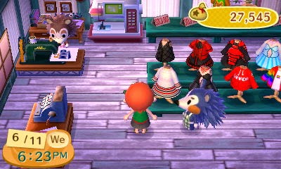
The benefits of making the design as you saw above is that A) it costs no money, and B) the design repeats onto pretty much anything. It's very versatile like that. By talking to Mabel in the Able Sisters' shop (the blue hedgehog is who I mean), you can even save all of your designs so you never lose them, which is an AWESOME feature in this game!

But what if you want to make a different design? Like a dress, or a long-sleeved shirt, or a tank (the nonviolent kind, not the warfaring type)? As I believe is exclusive to New Leaf, you can now make pro designs, allowing you to make more designs specific to dresses, hats, shirts, etcetera! The downside is that it does cost 500 bells to make them, but in my case, it's just a drop in the bucket, so it's not that big of a deal.

Is it a bird? A plane? No . . . it's the benefit of making a pro design!

The biggest difference between pro and normal designs, though, is that you can customize all sides/parts of a piece of clothing. In this case, I'm making my previous design a sleeveless shirt, but by working in a pro design, it's allowing me to customize the back. Which means I go from my short-sleeved, normal design . . .

 So much swagger, guys. Wait, but where's my pirate hat?!

. . . to a tank top perfect for supper- I mean, summer!

A back view, which is impossible to see because I couldn't zoom in the camera at the time.

It might be hard to tell in the above image, but I used the benefits of pro designs to take the heart off of the back of the shirt. Cool, right? Makes it look more like a shirt and less like a repeating design. The downside to the pro designs is that they're only intended for one use, i.e. ONLY as a shirt or hat, not both, but it's worth it for all of the cool designs.

And of course, Animal Crossing is all about sharing, and let's face it, I can't keep THIS GOOD of a design to myself. I would love to share it with you guys . . . if only there was a way! But wait . . . there's a sewing machine over there . . .


To answer your question: YES, I DID just share my awesome shirt with y'all. I'm pretty sure that's a prerequisite for AWESOME, because with this, a whole new, improved community for Animal Crossing has sprung up.

Part three, still on custom designs, will be coming up in a little bit.

***

Thanks for reading, you guys! Considering all of the work I've been putting into these posts (including the ones you haven't even seen yet!), it's only fair that I let you know what sources I've been using. Especially for those of you who might already be playing the game, I figure these might be nice for you to peruse.

DOOD Crossing 64: This guy-playing-as-a-girl isn't just pretty hilarious when it comes to posting about his town, but is also really good at designing his own stuff using the pro designs. Even his village and houses are awesome! Go check him out, because he's got street cred.

Bumbury the Beautiful: This player, going by the villager name Lady(star)Bro, has tons of patterns figured out and makes absolutely beautiful designs! I'll be talking a little more about her work at a later date, but for now, I did want to credit her because I did have one of her designs in my design storage. You can find that pattern here, as well as the rest of her QR codes on the same site.

If you have any questions, or you if want to see more of my own patterns, feel free to shoot me a note! I'm always up for shooting the breeze with a fellow art-teest.